caret เป็น package ยอดนิยมในภาษา R ในทำ machine learning (ML)
caret ย่อมาจาก Classification And REgression Training และเป็น package ที่ถูกออกแบบมาช่วยให้การทำ ML เป็นเรื่องง่ายโดยมี functions สำหรับทำงานกับ ML workflow เบ็ดเสร็จใน package เดียว
ในบทความนี้ เราจะไปดูตัวอย่างการใช้ caret กับ BostonHousing จาก mlbench กัน
ถ้าพร้อมแล้ว ไปเริ่มกันเลย
- 🏠 Dataset: BostonHousing
- 🔧 Build a Predictive Model
- 💪 Summary
- 📚 Further Readings
- 🐱 GitHub
- 📃 References
- ✅ R Book for Psychologists: หนังสือภาษา R สำหรับนักจิตวิทยา
🏠 Dataset: BostonHousing
BostonHousing เป็นชุดข้อมูลบ้านใน Boston, Massachusetts, US จาก mlbench package และประกอบด้วยข้อมูลบ้าน 14 columns ดังนี้:
| No. | Column | Description |
|---|---|---|
| 1 | crim | ระดับอาชญากรรมในแต่ละเขต |
| 2 | zn | สัดส่วนพื้นที่อาศัย |
| 3 | indus | สัดส่วนธุรกิจที่เป็น non-retail ในแต่ละเขต |
| 4 | chas | เป็นพื้นที่ติดกับ Charles River ไหม (1 = ติด, 0 = ไม่ติด) |
| 5 | nox | ระดับ nitrogen oxide |
| 6 | rm | จำนวนห้องโดยเฉลี่ย |
| 7 | age | สัดส่วย unit ที่มีคนเข้าอยู่ ซึ่งถูกสร้างก่อนปี ค.ศ. 1940 |
| 8 | dis | ระยะทางจากพื้นที่ทำงานในเมืองบอสตัน |
| 9 | rad | ระดับการเข้าถึง radial highways |
| 10 | tax | ภาษีโรงเรือน |
| 11 | ptratio | สัดส่วนนักเรียนต่อครูในแต่ละเขต |
| 12 | black | สัดส่วนผู้อยู่อาศัยที่เป็นคนผิวดำ |
| 13 | lstat | สัดส่วนของประชากรที่มีฐานะยากจน |
| 14 | medv | ราคากลางของบ้านที่มีผู้อยู่อาศัย |
เป้าหมายในการทำงานกับ BostonHousing คือ สร้าง model เพื่อทำนายราคาบ้าน (medv)
.
⬇️ Load BostonHousing
เราสามารถโหลด BostonHousing เพื่อนำมาใช้งานได้แบบนี้:
# Install mlbench
install.packages("mlbench")

# Load mlbench
library(caret)
library(mlbench)

# Load BostonHousing
data("BostonHousing")
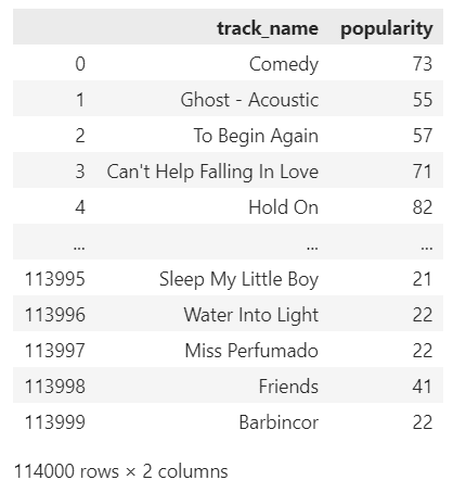
เราสามารถดูตัวอย่างข้อมูล BostonHousing ด้วย head():
# Preview
head(BostonHousing)
ผลลัพธ์:
     crim zn indus chas   nox    rm  age    dis rad tax ptratio      b lstat medv
1 0.00632 18  2.31    0 0.538 6.575 65.2 4.0900   1 296    15.3 396.90  4.98 24.0
2 0.02731  0  7.07    0 0.469 6.421 78.9 4.9671   2 242    17.8 396.90  9.14 21.6
3 0.02729  0  7.07    0 0.469 7.185 61.1 4.9671   2 242    17.8 392.83  4.03 34.7
4 0.03237  0  2.18    0 0.458 6.998 45.8 6.0622   3 222    18.7 394.63  2.94 33.4
5 0.06905  0  2.18    0 0.458 7.147 54.2 6.0622   3 222    18.7 396.90  5.33 36.2
6 0.02985  0  2.18    0 0.458 6.430 58.7 6.0622   3 222    18.7 394.12  5.21 28.7
และดูโครงสร้างชุดข้อมูลได้ด้วย str():
# View the structure
str(BostonHousing)
ผลลัพธ์:
'data.frame':	506 obs. of  14 variables:
 $ crim   : num  0.00632 0.02731 0.02729 0.03237 0.06905 ...
 $ zn     : num  18 0 0 0 0 0 12.5 12.5 12.5 12.5 ...
 $ indus  : num  2.31 7.07 7.07 2.18 2.18 2.18 7.87 7.87 7.87 7.87 ...
 $ chas   : Factor w/ 2 levels "0","1": 1 1 1 1 1 1 1 1 1 1 ...
 $ nox    : num  0.538 0.469 0.469 0.458 0.458 0.458 0.524 0.524 0.524 0.524 ...
 $ rm     : num  6.58 6.42 7.18 7 7.15 ...
 $ age    : num  65.2 78.9 61.1 45.8 54.2 58.7 66.6 96.1 100 85.9 ...
 $ dis    : num  4.09 4.97 4.97 6.06 6.06 ...
 $ rad    : num  1 2 2 3 3 3 5 5 5 5 ...
 $ tax    : num  296 242 242 222 222 222 311 311 311 311 ...
 $ ptratio: num  15.3 17.8 17.8 18.7 18.7 18.7 15.2 15.2 15.2 15.2 ...
 $ b      : num  397 397 393 395 397 ...
 $ lstat  : num  4.98 9.14 4.03 2.94 5.33 ...
 $ medv   : num  24 21.6 34.7 33.4 36.2 28.7 22.9 27.1 16.5 18.9 ...
🔧 Build a Predictive Model
การสร้าง model เพื่อทำนายราคาบ้านมีอยู่ 4 ขั้นตอน ได้แก่:
- Split the data
- Preprocess the data
- Train the model
- Evaluate the model
เราไปดูการใช้งาน caret สำหรับการทำงานแต่ละขั้นกัน
.
🪓 Step 1. Split the Data
ในขั้นแรก เราจะแบ่ง BostonHousing ออกเป็น 2 ชุด:
- Training set สำหรับสร้าง model
- Test set สำหรับประเมินประสิทธิภาพของ model
caret มี function สำหรับแบ่งชุดข้อมูล ซึ่งได้แก่ createDataPartition() ซึ่งต้องการ 3 arguments หลัก ดังนี้:
createDataPartition(y, p, list)
- y = ตัวแปรตามที่เราต้องการทำนาย
- p = สัดส่วนข้อมูลที่เราต้องการแบ่งให้กับ training set
- list = ต้องการผลลัพธ์เป็น list (
TRUE) หรือ matrix (FALSE)
สำหรับ BostonHousing เราจะแบ่ง 70% เป็น training set และ 30% เป็น test set แบบนี้:
# Set seed for reproducibility
set.seed(888)

# Get train index
train_index <- createDataPartition(BostonHousing$medv, # Specify the outcome
                                   p = 0.7, # Set aside 70% for training set
                                   list = FALSE) # Return as matrix

# Create training set
bt_train <- BostonHousing[train_index, ]

# Create test set
bt_test <- BostonHousing[-train_index, ]
เราสามารถดูจำนวนข้อมลใน training และ test sets ได้ด้วย nrow():
# Check the results
cat("Rows in training set:", nrow(bt_train), "\\n")
cat("Rows in test set:", nrow(bt_test))
ผลลัพธ์:
Rows in training set: 356
Rows in test set: 150
.
🍳 Step 2. Preprocess the Data
ในขั้นที่ 2 เราจะเตรียมข้อมูลเพื่อใช้ในการสร้าง model
caret มี function ที่ช่วยให้เราเตรียมข้อมูลได้ง่าย นั่นคือ preProcess() ซึ่งต้องการ 2 arguments หลัก ดังนี้:
preProcess(x, method)
- x = ชุดข้อมูลที่เราต้องการใช้
- method = วิธีการเตรียมข้อมูลที่เราต้องการ
สำหรับตัวอย่างนี้ เราจะใช้ 2 วิธีในการเตรียมข้อมูล ได้แก่:
- centre หรือการปรับ mean ให้เท่ากับ 0
- scale หรือการปรับ standard deviation ให้เท่ากับ 1
เราสามารถใช้ preProcess() ได้ดังนี้:
# Learn preprocessing on training set
ppc <- preProcess(bt_train[, -14], # Select all predictors
                  method = c("center", "scale"))  # Centre and scale
ตอนนี้ เราจะได้วิธีการเตรียมข้อมูลมาแล้ว ซึ่งเราจะต้องนำไปปรับใช้กับ training และ test sets ด้วย predict() และ cbind() แบบนี้:
Training set:
# Apply preprocessing to training set
bt_train_processed <- predict(ppc,
                              bt_train[, -14])

# Combine the preprocessed training set with outcome
bt_train_processed <- cbind(bt_train_processed,
                            medv = bt_train$medv)
Test set:
# Apply preprocessing to test set
bt_test_processed <- predict(ppc,
                             bt_test[, -14])

# Combine the preprocessed test set with outcome
bt_test_processed <- cbind(bt_test_processed,
                            medv = bt_test$medv)
ตอนนี้ training และ test sets ก็พร้อมที่จะใช้ในการสร้าง model แล้ว
.
👟 Step 3. Train the Model
ในขั้นที่ 3 เราจะสร้าง model กัน
โดยในตัวอย่าง เราจะลองสร้าง k-nearest neighbor (KNN) model ซึ่งทำนายข้อมูลด้วยการดูข้อมูลที่อยู่ใกล้เคียง
ในการสร้าง model, caret มี function ที่ทรงพลังและใช้งานง่ายอยู่ นั่นคือ train() ซึ่งต้องการ 5 arguments หลัก ดังนี้:
train(form, data, method, trControl, tuneGrid)
- form = สูตรที่ระบุตัวแปรต้นและตัวแปรตาม (ตัวแปรตาม ~ ตัวแปรต้น)
- data = ชุดข้อมูลที่จะใช้สร้าง model
- method = engine ที่จะใช้ในการสร้าง model (ดูรายการ engine ทั้งหมดได้ที่ The caret Package — Available Models)
- trControl = ค่าที่กำหนดการสร้าง model (ต้องใช้ function ชื่อ
trainControl()ในการกำหนด) - tuneGrid = data frame ที่กำหนดค่า hyperparametre เพื่อทำ model tuning และหา model ที่ดีที่สุด
เราสามารถใช้ train() เพื่อสร้าง KNN model ในการทำนายราคาบ้านได้แบบนี้:
# Define training control:
# use k-fold cross-validation where k = 5
trc <- trainControl(method = "cv",
                    number = 5)

# Define grid:
# set k as odd numbers between 3 and 13
grid <- data.frame(k = seq(from = 3,
                           to = 13,
                           by = 2))

# Train the model
knn_model <- train(medv ~ ., # Specify the formula
                   data = bt_train_processed, # Use training set
                   method = "kknn", # Use knn engine
                   trControl = trc, # Specify training control
                   tuneGrid = grid) # Use grid to tune the model
เราสามารถดูรายละเอียดของ model ได้ดังนี้:
# Print the model
knn_model
ผลลัพธ์:
k-Nearest Neighbors

356 samples
 13 predictor

No pre-processing
Resampling: Cross-Validated (5 fold)
Summary of sample sizes: 284, 286, 286, 284, 284
Resampling results across tuning parameters:

  k   RMSE      Rsquared   MAE
   3  4.357333  0.7770080  2.840630
   5  4.438162  0.7760085  2.849984
   7  4.607954  0.7610468  2.941034
   9  4.683062  0.7577702  2.972661
  11  4.771317  0.7508908  3.043617
  13  4.815444  0.7524266  3.053415

RMSE was used to select the optimal model using the smallest value.
The final value used for the model was k = 3.
.
📈 Step 4. Evaluate the Model
ในขั้นสุดท้าย เราจะประเมินความสามารถของ model ในการทำนายราคาบ้านกัน
สำหรับ regression model, caret มี 3 functions ที่ช่วยในการประเมิน ได้แก่:
MAE()เพื่อหา mean absolute error (MAE) หรือค่าความคลาดเคลื่อนแบบสัมบูรณ์RMSE()เพื่อหา root mean square error (RMSE) หรือค่าความคลาดเคลื่อนแบบกำลังสองR2()เพื่อหา R-squared หรือสัดส่วนของตัวแปรตามที่ model สามารถทำนายได้
เราสามารถใช้ทั้ง 3 functions ได้ดังนี้:
# Make predictions
predictions <- predict(knn_model,
                       newdata = bt_test_processed)

# Calculate MAE
mae <- MAE(predictions,
           bt_test_processed$medv)

# Calculate RMSE
rmse <- RMSE(predictions,
             bt_test_processed$medv)

# Calculate R squared
r2 <- R2(predictions,
         bt_test_processed$medv)
จากนั้น เราสามารถรวมผลลัพธ์ไว้ใน data frame เพื่อแสดงผลได้:
# Combine the results
results <- data.frame(Model = "KNN",
                      MAE = round(mae, 2),
                      RMSE = round(rmse, 2),
                      R_Squared = round(r2, 2))

# Print the results
results
ผลลัพธ์:
  Model  MAE RMSE R_Squared
1   KNN 2.67 3.74      0.86
จะเห็นได้ว่า model ของเรามีความคลาดเคลื่อนโดยเฉลี่ย 2.67 (MAE) และสามารถทำนาย 86% ของราคาบ้านทั้งหมดได้ (R_Squared)
💪 Summary
ในบทความนี้ เราได้ไปทำความรู้จักกับ caret ซึ่งเป็น package ในการสร้าง ML model ที่ทรงพลังและใช้งานง่าย โดยเราได้เรียนรู้ functions ในการทำงานดังนี้:
| ML Workflow | Function | For |
|---|---|---|
| Split the data | createDataPartition() | สร้าง index สำหรับแบ่งข้อมูล |
| Preprocess the data | preProcess() | เตรียมข้อมูลสำหรับสร้าง model |
| Train the model | train() | สร้าง model |
| Evaluate the model | MAE() | หาค่า MAE |
| Evaluate the model | RMSE() | หาค่า RMSE |
| Evaluate the model | R2() | หาค่า R-squared |
📚 Further Readings
สำหรับคนที่สนใจ สามารถอ่านเพิ่มเติมเกี่ยวกับ caret ได้ที่:
🐱 GitHub
ดู code ทั้งหมดในบทความนี้ได้ที่ GitHub
📃 References
- รู้จักกับ caret – ML Lib ที่ทรงพลังที่สุดของภาษา R
- code from ‘ML with caret in R’ course on DataCamp
✅ R Book for Psychologists: หนังสือภาษา R สำหรับนักจิตวิทยา
📕 ขอฝากหนังสือเล่มแรกในชีวิตด้วยนะครับ 😆
🙋 ใครที่กำลังเรียนจิตวิทยาหรือทำงานสายจิตวิทยา และเบื่อที่ต้องใช้ software ราคาแพงอย่าง SPSS และ Excel เพื่อทำข้อมูล
💪 ผมขอแนะนำ R Book for Psychologists หนังสือสอนใช้ภาษา R เพื่อการวิเคราะห์ข้อมูลทางจิตวิทยา ที่เขียนมาเพื่อนักจิตวิทยาที่ไม่เคยมีประสบการณ์เขียน code มาก่อน
ในหนังสือ เราจะปูพื้นฐานภาษา R และพาไปดูวิธีวิเคราะห์สถิติที่ใช้บ่อยกัน เช่น:
- Correlation
- t-tests
- ANOVA
- Reliability
- Factor analysis
🚀 เมื่ออ่านและทำตามตัวอย่างใน R Book for Psychologists ทุกคนจะไม่ต้องพึง SPSS และ Excel ในการทำงานอีกต่อไป และสามารถวิเคราะห์ข้อมูลด้วยตัวเองได้ด้วยความมั่นใจ
แล้วทุกคนจะแปลกใจว่า ทำไมภาษา R ง่ายขนาดนี้ 🙂↕️
👉 สนใจดูรายละเอียดหนังสือได้ที่ meb: