ในบทความนี้ เราจะไปทำความรู้จักกับ random forest รวมทั้งการสร้าง ประเมิน และปรับทูน random forest model ด้วย ranger package ในภาษา R
ถ้าพร้อมแล้ว ไปเริ่มกันเลย
- 🌲 Random Forest Model คืออะไร?
- 💻 Random Forest Models ในภาษา R
- 🚗 mpg Dataset
- 🐣 ranger Basics
- ⏲️ Hyperparametre Tuning
- 🍩 Bonus: Variable Importance
- 😎 Summary
- 😺 GitHub
- 📃 References
- ✅ R Book for Psychologists: หนังสือภาษา R สำหรับนักจิตวิทยา
🌲 Random Forest Model คืออะไร?
Random forest model เป็น tree-based model ซึ่งสุ่มสร้าง decision trees ขึ้นมาหลาย ๆ ต้น (forest) และใช้ผลลัพธ์ในภาพรวมเพื่อทำนายข้อมูลสุดท้าย:
- Regression task: หาค่าเฉลี่ยของผลลัพธ์จากทุกต้น
- Classification task: ดูผลลัพธ์ที่เป็นเสียงโหวตข้างมาก
Random forest เป็น model ที่ทรงพลัง เพราะใช้ผลรวมของหลาย ๆ decision trees แม้ว่า decision tree แต่ละต้นจะมีความสามารถในการทำนายนอยก็ตาม
💻 Random Forest Models ในภาษา R
ในภาษา R เรามี 2 packages ที่นิยมใช้สร้าง random forest model ได้แก่:
randomForestซึ่งเป็น package ที่มีลูกเล่น แต่เก่ากว่าrangerซึ่งใหม่กว่า ประมวลผลได้เร็วกว่า และใช้งานง่ายกว่า
ในบทความก่อน เราดูวิธีการใช้ randomForest แล้ว
ในบทความนี้ เราจะไปดูวิธีใช้ ranger โดยใช้ mpg dataset เป็นตัวอย่างกัน
🚗 mpg Dataset
mpg dataset เป็น dataset จาก ggplots2 package และมีข้อมูลของรถ 38 รุ่น จากช่วงปี ช่วง ค.ศ. 1999 ถึง 2008 ทั้งหมด 11 columns ดังนี้:
| No. | Column | Description |
|---|---|---|
| 1 | manufacturer | ผู้ผลิต |
| 2 | model | รุ่นรถ |
| 3 | displ | ขนาดถังน้ำมัน (ลิตร) |
| 4 | year | ปีที่ผลิต |
| 5 | cyl | จำนวนลูกสูบ |
| 6 | trans | ประเภทเกียร์ |
| 7 | drv | ประเภทล้อขับเคลื่อน |
| 8 | cty | ระดับการกินน้ำมันเวลาวิ่งในเมือง |
| 9 | hwy | ระดับการกินน้ำมันเวลาวิ่งบน highway |
| 10 | fl | ประเภทน้ำมัน |
| 11 | class | ประเภทรถ |
ในบทความนี้ เราจะลองใช้ ranger เพื่อทำนาย hwy กัน
เราสามารถเตรียม mpg เพื่อสร้าง random forest model ได้ดังนี้
โหลด dataset:
# Install ggplot2
install.packages("ggplot2")

# Load ggplot2
library(ggplot2)

# Load the dataset
data(mpg)
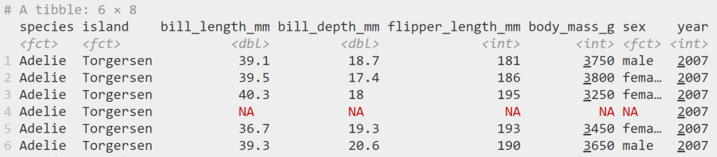
ดูตัวอย่าง dataset:
# Preview
head(mpg)
ผลลัพธ์:
# A tibble: 6 × 11
  manufacturer model displ  year   cyl trans      drv     cty   hwy fl    class
  <chr>        <chr> <dbl> <int> <int> <chr>      <chr> <int> <int> <chr> <chr>
1 audi         a4      1.8  1999     4 auto(l5)   f        18    29 p     compact
2 audi         a4      1.8  1999     4 manual(m5) f        21    29 p     compact
3 audi         a4      2    2008     4 manual(m6) f        20    31 p     compact
4 audi         a4      2    2008     4 auto(av)   f        21    30 p     compact
5 audi         a4      2.8  1999     6 auto(l5)   f        16    26 p     compact
6 audi         a4      2.8  1999     6 manual(m5) f        18    26 p     compact
สำรวจโครงสร้าง:
# View the structure
str(mpg)
ผลลัพธ์:
tibble [234 × 11] (S3: tbl_df/tbl/data.frame)
 $ manufacturer: chr [1:234] "audi" "audi" "audi" "audi" ...
 $ model       : chr [1:234] "a4" "a4" "a4" "a4" ...
 $ displ       : num [1:234] 1.8 1.8 2 2 2.8 2.8 3.1 1.8 1.8 2 ...
 $ year        : int [1:234] 1999 1999 2008 2008 1999 1999 2008 1999 1999 2008 ...
 $ cyl         : int [1:234] 4 4 4 4 6 6 6 4 4 4 ...
 $ trans       : chr [1:234] "auto(l5)" "manual(m5)" "manual(m6)" "auto(av)" ...
 $ drv         : chr [1:234] "f" "f" "f" "f" ...
 $ cty         : int [1:234] 18 21 20 21 16 18 18 18 16 20 ...
 $ hwy         : int [1:234] 29 29 31 30 26 26 27 26 25 28 ...
 $ fl          : chr [1:234] "p" "p" "p" "p" ...
 $ class       : chr [1:234] "compact" "compact" "compact" "compact" ...
จากผลลัพธ์จะเห็นว่า บาง columns (เช่น manufacturer, model) มีข้อมูลประเภท character ซึ่งเราควระเปลี่ยนเป็น factor เพื่อช่วยให้การสร้าง model มีประสิทธิภาพมากขึ้น:
# Convert character columns to factor

## Get character columns
chr_cols <- c("manufacturer", "model",
              "trans", "drv",
              "fl", "class")

## For-loop through the character columns
for (col in chr_cols) {
  mpg[[col]] <- as.factor(mpg[[col]])
}

## Check the results
str(mpg)
ผลลัพธ์:
tibble [234 × 11] (S3: tbl_df/tbl/data.frame)
 $ manufacturer: Factor w/ 15 levels "audi","chevrolet",..: 1 1 1 1 1 1 1 1 1 1 ...
 $ model       : Factor w/ 38 levels "4runner 4wd",..: 2 2 2 2 2 2 2 3 3 3 ...
 $ displ       : num [1:234] 1.8 1.8 2 2 2.8 2.8 3.1 1.8 1.8 2 ...
 $ year        : int [1:234] 1999 1999 2008 2008 1999 1999 2008 1999 1999 2008 ...
 $ cyl         : int [1:234] 4 4 4 4 6 6 6 4 4 4 ...
 $ trans       : Factor w/ 10 levels "auto(av)","auto(l3)",..: 4 9 10 1 4 9 1 9 4 10 ...
 $ drv         : Factor w/ 3 levels "4","f","r": 2 2 2 2 2 2 2 1 1 1 ...
 $ cty         : int [1:234] 18 21 20 21 16 18 18 18 16 20 ...
 $ hwy         : int [1:234] 29 29 31 30 26 26 27 26 25 28 ...
 $ fl          : Factor w/ 5 levels "c","d","e","p",..: 4 4 4 4 4 4 4 4 4 4 ...
 $ class       : Factor w/ 7 levels "2seater","compact",..: 2 2 2 2 2 2 2 2 2 2 ...
ตอนนี้ เราพร้อมที่จะนำ dataset ไปใช้งานกับ ranger แล้ว
🐣 ranger Basics

การใช้งาน ranger มีอยู่ 4 ขั้นตอน:
- ติดตั้งและโหลด
ranger - สร้าง training และ test sets
- สร้าง random forest model
- ทดสอบความสามารถของ model
.
1️⃣ ติดตั้งและโหลด ranger
ในครั้งแรกสุด ให้เราติดตั้ง ranger ด้วยคำสั่ง install.packages():
# Install
install.packages("ranger")
และทุกครั้งที่เราต้องการใช้งาน ranger ให้เราเรียกใช้งานด้วย library():
# Load
library(ranger)
.
2️⃣ สร้าง Training และ Test Sets
ในขั้นที่ 2 เราจะแบ่ง dataset เป็น 2 ส่วน ได้แก่:
- Training set สำหรับสร้าง model (70% ของ dataset)
- Test set สำหรับทดสอบ model (30% ของ dataset)
# Split the data

## Set seed for reproducibility
set.seed(123)

## Get training rows
train_rows <- sample(nrow(mpg),
                     nrow(mpg) * 0.7)

## Create a training set
train <- mpg[train_rows, ]

## Create a test set
test <- mpg[-train_rows, ]
.
3️⃣ สร้าง Random Forest Model
ในขั้นที่ 3 เราจะสร้าง random forest ด้วย ranger() ซึ่งต้องการ input หลัก 2 อย่าง ดังนี้:
ranger(formula, data)
- formula: ระบุตัวแปรต้นและตัวแปรตามที่ใช้ในการสร้าง model
- data: dataset ที่ใช้สร้าง model (เราจะใช้ training set กัน)
เราจะเรียกใช้ ranger() ดังนี้:
# Initial random forest model

## Set seed for reproducibility
set.seed(123)

## Train the model
rf_model <- ranger(hwy ~ .,
                   data = train)
Note: เราใช้ set.seed() เพื่อให้เราสามารถสร้าง model ซ้ำได้ เพราะ random forest มีการสร้าง decision trees แบบสุ่ม
เมื่อได้ model มาแล้ว เราสามารถดูรายละเอียดของ model ได้แบบนี้:
# Print the model
rf_model
ผลลัพธ์:
Ranger result

Call:
 ranger(hwy ~ ., data = train)

Type:                             Regression
Number of trees:                  500
Sample size:                      163
Number of independent variables:  10
Mtry:                             3
Target node size:                 5
Variable importance mode:         none
Splitrule:                        variance
OOB prediction error (MSE):       1.682456
R squared (OOB):                  0.9584596
ในผลลัพธ์ เราจะเห็นลักษณะต่าง ๆ ของ model เช่น ประเภท model (type) และ จำนวน decision trees ที่ถูกสร้างขึ้นมา (sample size)
.
4️⃣ ทดสอบความสามารถของ Model
สุดท้าย เราจะทดสอบความสามารถของ model ในการทำนายข้อมูล โดยเริ่มจากใช้ model ทำนายข้อมูลใน test set:
# Make predictions
preds <- predict(rf_model,
                 data = test)$predictions
จากนั้น คำนวณตัวบ่งชี้ความสามารถ (metric) ซึ่งสำหรับ regression model มีอยู่ 3 ตัว ได้แก่:
- MAE (mean absolute error): ค่าเฉลี่ยความคลาดเคลื่อนแบบสัมบูรณ์ (ยิ่งน้อยยิ่งดี)
- RMSE (root mean square error): ค่าเฉลี่ยความคาดเคลื่อนแบบยกกำลังสอง (ยิ่งน้อยยิ่งดี)
- R squared: สัดส่วนข้อมูลที่อธิบายได้ด้วย model (ยิ่งมากยิ่งดี)
# Get errors
errors <- test$hwy - preds

# Calculate MAE
mae <- mean(abs(errors))

# Calculate RMSE
rmse <- sqrt(mean(errors^2))

# Calculate R squared
r_sq <- 1 - (sum((errors)^2) / sum((test$hwy - mean(test$hwy))^2))

# Print the results
cat("Initial model MAE:", round(mae, 2), "\n")
cat("Initial model RMSE:", round(rmse, 2), "\n")
cat("Initial model R squared:", round(r_sq, 2), "\n")
ผลลัพธ์:
Initial model MAE: 0.79
Initial model RMSE: 1.07
Initial model R squared: 0.95
⏲️ Hyperparametre Tuning
ranger มี hyperparametre มากมายที่เราสามารถปรับแต่งเพื่อเพิ่มประสิทธิภาพของ random forest model ได้ เช่น:
num.trees: จำนวน decision trees ที่จะสร้างmtry: จำนวนตัวแปรต้นที่จะถูกสุ่มไปใช้ในแต่ละ nodemin.node.size: จำนวนข้อมูลขั้นต่ำที่แต่ละ node จะต้องมี
เราสามารถใช้ for loop เพื่อปรับหาค่า hyperparametre ที่ดีที่สุดได้ดังนี้:
# Define hyperparametres
ntree_vals <- c(300, 500, 700)
mtry_vals <- 2:5
min_node_vals <- c(1, 5, 10)

# Create a hyperparametre grid
grid <- expand.grid(num.trees = ntree_vals,
                    mtry = mtry_vals,
                    min.node.size = min_node_vals)

# Instantiate an empty data frame
hpt_results <- data.frame()

# For-loop through the hyperparametre grid
for (i in 1:nrow(grid)) {

  ## Get the combination
  params <- grid[i, ]

  ## Set seed for reproducibility
  set.seed(123)

  ## Fit the model
  model <- ranger(hwy ~ .,
                  data = train,
                  num.trees = params$num.trees,
                  mtry = params$mtry,
                  min.node.size = params$min.node.size)

  ## Make predictions
  preds <- predict(model,
                   data = test)$predictions

  ## Get errors
  errors <- test$hwy - preds

  ## Calculate MAE
  mae <- mean(abs(errors))

  ## Calculate RMSE
  rmse <- sqrt(mean(errors^2))

  ## Store the results
  hpt_results <- rbind(hpt_results,
                       cbind(params,
                             MAE = mae,
                             RMSE = rmse))
}

# View the results
hpt_results
ผลลัพธ์:
   num.trees mtry min.node.size       MAE      RMSE
1        300    2             1 0.8101026 1.0971836
2        500    2             1 0.8012484 1.0973957
3        700    2             1 0.8039271 1.1001252
4        300    3             1 0.7434543 1.0051344
5        500    3             1 0.7417985 1.0069989
6        700    3             1 0.7421666 1.0028184
7        300    4             1 0.6989314 0.9074216
8        500    4             1 0.7130704 0.9314843
9        700    4             1 0.7141147 0.9292718
10       300    5             1 0.7157657 0.9370918
11       500    5             1 0.7131899 0.9266787
12       700    5             1 0.7091556 0.9238312
13       300    2             5 0.8570125 1.1673637
14       500    2             5 0.8515116 1.1736009
15       700    2             5 0.8522571 1.1756648
16       300    3             5 0.7885005 1.0654548
17       500    3             5 0.7872713 1.0664734
18       700    3             5 0.7859149 1.0581331
19       300    4             5 0.7561500 0.9790160
20       500    4             5 0.7623437 0.9869463
21       700    4             5 0.7611660 0.9813048
22       300    5             5 0.7615190 0.9777769
23       500    5             5 0.7615861 0.9804616
24       700    5             5 0.7613151 0.9788333
25       300    2            10 0.9257704 1.2391377
26       500    2            10 0.9292344 1.2611164
27       700    2            10 0.9258555 1.2635794
28       300    3            10 0.8790601 1.1635695
29       500    3            10 0.8704461 1.1594165
30       700    3            10 0.8704562 1.1507016
31       300    4            10 0.8609516 1.0887466
32       500    4            10 0.8672105 1.0962367
33       700    4            10 0.8624934 1.0875710
34       300    5            10 0.8558867 1.0811168
35       500    5            10 0.8567463 1.0783473
36       700    5            10 0.8536824 1.0751511
จะเห็นว่า เราจะได้ MSE และ RMSE ของส่วนผสมระหว่างแต่ละ hyperparametre มา
เราสามารถใช้ ggplot() เพื่อช่วยเลือก hyperparametres ที่ดีที่สุดได้ดังนี้:
# Visualise the results
ggplot(hpt_results,
       aes(x = mtry,
           y = RMSE,
           color = factor(num.trees))) +

  ## Use scatter plot
  geom_point(aes(size = min.node.size)) +

  ## Set theme to minimal
  theme_minimal() +

  ## Add title, labels, and legends
  labs(title = "Hyperparametre Tuning Results",
       x = "mtry",
       y = "RMSE",
       color = "num.trees",
       size = "min.node.size")
ผลลัพธ์:
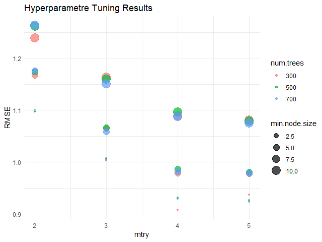
จากกราฟ จะเห็นได้ว่า hyperparametres ที่ดีที่สุด (มี RMSE น้อยที่สุด) คือ:
num.trees= 300mtry= 4min.node.size= 2.5
เมื่อได้ค่า hyperparametres แล้ว เราสามารถใส่ค่าเหล่านี้กลับเข้าไปใน model และทดสอบความสามารถได้เลย
สร้าง model:
# Define the best hyperparametres
best_num.tree <- 300
best_mtry <- 4
best_min.node.size <- 2.5

# Fit the model
rf_model_new <- ranger(hwy ~ .,
                       data = train,
                       num.tree = best_num.tree,
                       mtry = best_mtry,
                       min.node.size = best_min.node.size)
ทดสอบความสามารถ:
# Evaluate the model

## Make predictions
preds_new <- predict(rf_model_new,
                     data = test)$predictions

## Get errors
errors_new <- test$hwy - preds_new

## Calculate MAE
mae_new <- mean(abs(errors_new))

## Calculate RMSE
rmse_new <- sqrt(mean(errors_new^2))

## Calculate R squared
r_sq_new <- 1 - (sum((errors_new)^2) / sum((test$hwy - mean(test$hwy))^2))

## Print the results
cat("Final model MAE:", round(mae_new, 2), "\n")
cat("Final model RMSE:", round(rmse_new, 2), "\n")
cat("Final model R squared:", round(r_sq_new, 2), "\n")
ผลลัพธ์:
Final model MAE: 0.71
Final model RMSE: 0.93
Final model R squared: 0.96
เราสามารถเปรียบเทียบความสามารถของ model ล่าสุด (final model) กับ model ก่อนหน้านี้ (initial model) ได้:
# Compare the two models
model_comp <- data.frame(Model = c("Initial", "Final"),
                         MAE = c(round(mae, 2), round(mae_new, 2)),
                         RMSE = c(round(rmse, 2), round(rmse_new, 2)),
                         R_Squared = c(round(r_sq, 2), round(r_sq_new, 2)))

# Print
model_comp
ผลลัพธ์:
    Model  MAE RMSE R_Squared
1 Initial 0.85 1.08      0.95
2   Final 0.71 0.93      0.96
ซึ่งจะเห็นว่า model ใหม่สามารถทำนายข้อมูลได้ดีขึ้น เพราะมี MAE และ RMSE ที่ลดลง รวมทั้ง R squared ที่เพิ่มขึ้น
🍩 Bonus: Variable Importance
ส่งท้าย ในกรณีที่เราต้องการดูว่า ตัวแปรต้นไหนมีความสำคัญต่อการทำนายมากที่สุด เราสามารถใช้ importance argument ใน ranger() คู่กับ vip() จาก vip package ได้แบบนี้:
# Fit the model with importance
rf_model_new <- ranger(hwy ~ .,
                       data = train,
                       num.tree = best_num.tree,
                       mtry = best_mtry,
                       min.node.size = best_min.node.size,
                       importance = "permutation") # Add importance

# Install vip package
install.packages("vip")

# Load vip package
library(vip)

# Get variabe importance
vip(rf_model_new)  +

  ## Add title and labels
  labs(title = "Variable Importance - Final Random Forest Model",
       x = "Variables",
       y = "Importance") +

  ## Set theme to minimal
  theme_minimal()
ผลลัพธ์:
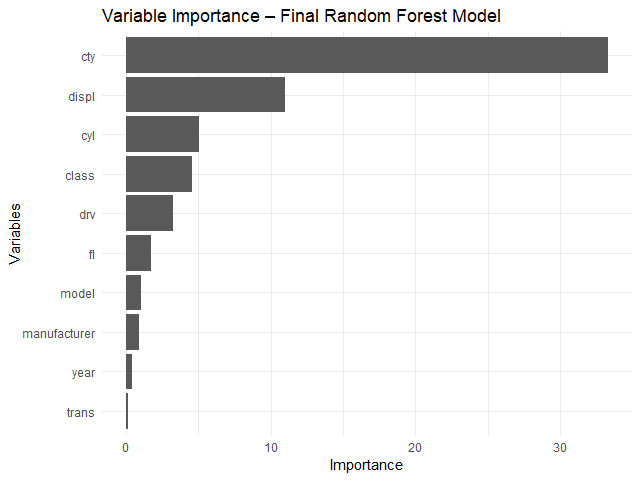
จากกราฟ จะเห็นได้ว่า ตัวแปรต้นที่สำคัญที่สุด 3 ตัว ได้แก่:
cty: ระดับการกินน้ำมันเวลาวิ่งในเมืองdispl: ขนาดถังน้ำมัน (ลิตร)cyl: จำนวนลูกสูบ
😎 Summary
ในบทความนี้ เราได้ดูวิธีการใช้ ranger package เพื่อ:
- สร้าง random forest model
- ปรับทูน model
พร้อมวิธีการประเมิน model ด้วย predict() และการคำนวณ MAE, RMSE, และ R squared รวมทั้งดูความสำคัญของตัวแปรต้นด้วย vip package
😺 GitHub
ดู code ทั้งหมดในบทความนี้ได้ที่ GitHub
📃 References
✅ R Book for Psychologists: หนังสือภาษา R สำหรับนักจิตวิทยา
📕 ขอฝากหนังสือเล่มแรกในชีวิตด้วยนะครับ 😆
🙋 ใครที่กำลังเรียนจิตวิทยาหรือทำงานสายจิตวิทยา และเบื่อที่ต้องใช้ software ราคาแพงอย่าง SPSS และ Excel เพื่อทำข้อมูล
💪 ผมขอแนะนำ R Book for Psychologists หนังสือสอนใช้ภาษา R เพื่อการวิเคราะห์ข้อมูลทางจิตวิทยา ที่เขียนมาเพื่อนักจิตวิทยาที่ไม่เคยมีประสบการณ์เขียน code มาก่อน
ในหนังสือ เราจะปูพื้นฐานภาษา R และพาไปดูวิธีวิเคราะห์สถิติที่ใช้บ่อยกัน เช่น:
- Correlation
- t-tests
- ANOVA
- Reliability
- Factor analysis
🚀 เมื่ออ่านและทำตามตัวอย่างใน R Book for Psychologists ทุกคนจะไม่ต้องพึง SPSS และ Excel ในการทำงานอีกต่อไป และสามารถวิเคราะห์ข้อมูลด้วยตัวเองได้ด้วยความมั่นใจ
แล้วทุกคนจะแปลกใจว่า ทำไมภาษา R ง่ายขนาดนี้ 🙂↕️
👉 สนใจดูรายละเอียดหนังสือได้ที่ meb: