ในบทความนี้ เราจะมาทำความรู้จักกับ seaborn และวิธีการใช้ seaborn เพื่อสร้างและตกแต่งกราฟเบื้องต้นกัน
ถ้าพร้อมแล้วมาเริ่มกันเลย
⚓ Intro to Seaborn 🍔 Dataset ตัวอย่าง 🤔 ก่อนเริ่มสร้างกราฟ 💻 Syntax ของ Seaborn 👉 การสร้างกราฟพื้นฐาน 📊 1. Histograms 📊 2. Box Plots 📊 3. Scatter Plots 📊 4. Line Plots 📊 5. Bar Plots 🔵 การใช้สีเพื่อเพิ่มตัวแปรในกราฟ 🖼️ การตกแต่งกราฟ 🎨 1. สี 🎨 2. Style 🎨 3. ข้อความ 💪 สรุป Seaborn 101 ⏭️ Next 🧑💻 Example Code on GitHub 📚 Further Reading ⚓ Intro to Seaborn seaborn เป็น library สำหรับ visualise data ใน Python ซึ่งต่อยอดมาจาก:
pandas: library สำหรับ data transformationmatplotlib: library สำหรับสร้างกราฟ
เพราะ seaborn ต่อยอดจาก pandas และ matplotlib จึงทำให้เราสามารถใช้ 3 libraries นี้ร่วมกันได้อย่างลงตัว
จุดเด่นหลักของ seaborn คือ ความสามารถในการสร้างกราฟที่สวยงามได้อย่างง่าย
มาดูกันว่า การสร้างกราฟด้วย seaborn ง่ายแค่ไหน
🍔 Dataset ตัวอย่าง ในบทความนี้ เราจะใช้ tips ซึ่งเป็น built-in datasets ของ seaborn เพื่อดูวิธีใช้ seaborn กัน
tips เป็น dataset เกี่ยวกับ tip ที่พนักงานในร้านอาหารได้รับ โดยมี columns ดังนี้:
No. Column Description 1 total_billจำนวนเงินค่าอาหาร 2 tipจำนวนเงินค่า tip 3 sexเพศของคนจ่ายบิล 4 smokerสถานะการสูบบุหรี่ของคนจ่ายบิล (สูบ vs ไม่สูบ) 5 dayวันของสัปดาห์ 6 timeช่วงเวลาของวัน (lunch vs dinner) 7 sizeจำนวนแขกที่มาด้วยกัน
🤔 ก่อนเริ่มสร้างกราฟ
ก่อนเริ่มสร้างกราฟ ให้เราทำ 2 อย่าง ก่อน:
.
(1) import seaborn ก่อน พร้อมกับ libraries อื่น ๆ ที่มักใช้ร่วมกัน:
# Import libraries
import pandas as pd
import matplotlib.pyplot as plt
import seaborn as sns
Note: seaborn ใช้ตัวย่อว่า sns ตามชื่อตัวละคร Samuel Norman Seaborn
.
(2) ต่อจากนั้นให้ load dataset tips ที่จะใช้งาน:
# Load the dataset
tips = sns.load_dataset("tips")
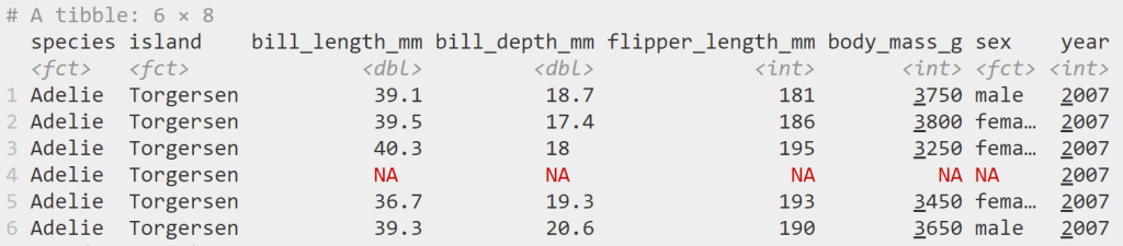
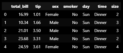
Note: ถ้าเรา preview ด้วย .head() เราจะเห็นข้อมูลแบบนี้:
Dataset: tips ในกรณีที่เราต้องการ import dataset จากข้างนอก เราสามารถใช้ pandas ช่วยได้ เช่น pd.read_csv() เพื่อโหลดไฟล์ CSV
💻 Syntax ของ Seaborn Syntax ในการสร้างกราฟด้วย seaborn มีดังนี้:
sns.plot = เรียกชื่อกราฟที่ต้องการสร้างdata = ชุดข้อมูลที่ใช้สร้างกราฟx = ข้อมูลแกน xy = ข้อมูลแกน ycustomisation = การตั้งค่าเพื่อตกแต่งกราฟplt.show() = แสดงกราฟบนหน้าจอ
👉 การสร้างกราฟพื้นฐาน
มาดูวิธีการสร้าง 5 กราฟพื้นฐาน กัน:
Histogram
Box plot
Scatter plot
Line plot
Bar plot
.
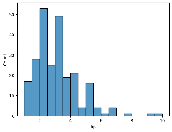
📊 1. Histograms Histogram เป็นกราฟเพื่อสำรวจการกระจายตัว (distribution) ของข้อมูล
ตัวอย่าง:
ดูการกระจายตัวของ tip ที่พนักงานได้รับ:
# Create a histogram of tips
sns.histplot(data = tips,
             x = "tip")

# Show the plot
plt.show()
Note: สำหรับ histogram เราจะละแกน y ไว้ เพราะ y จะแสดงความถี่ของข้อมูลบนแกน x
ผลลัพธ์:
Histogram Note: จะเห็นว่า tip ที่พนักงานได้รับ อยู่ในช่วง 0.5 ถึง 10 ดอลล่าร์ โดยอยู่ในช่วง 2 ถึง 4 ดอลล่าร์มากที่สุด
.
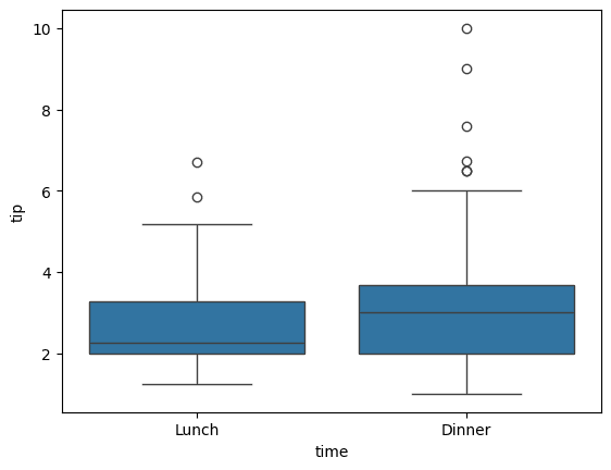
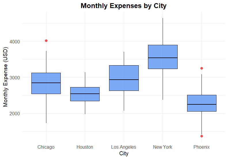
📊 2. Box Plots Box plot ทำหน้าที่คล้ายกับ histogram คือ ช่วยในการสำรวจการกระจายตัวของข้อมูล
ข้อแตกต่างของ box plot จาก histogram ก็คือ เราสามารถดู distribution หลาย ๆ อันได้บน box plot
ตัวอย่าง:
ดูการกระจายตัวของ tip ที่ได้ แบ่งตามมื้ออาหาร
# Create a box plot of tips by time
sns.boxplot(data = tips,
            x = "time",
            y = "tip")

# Show the plot
plt.show()
ผลลัพธ์:
Box plot Note: จะเห็นว่า การกระจายตัวของ tip ในแต่ละมื้อมีความใกล้เคียงกันมาก
.
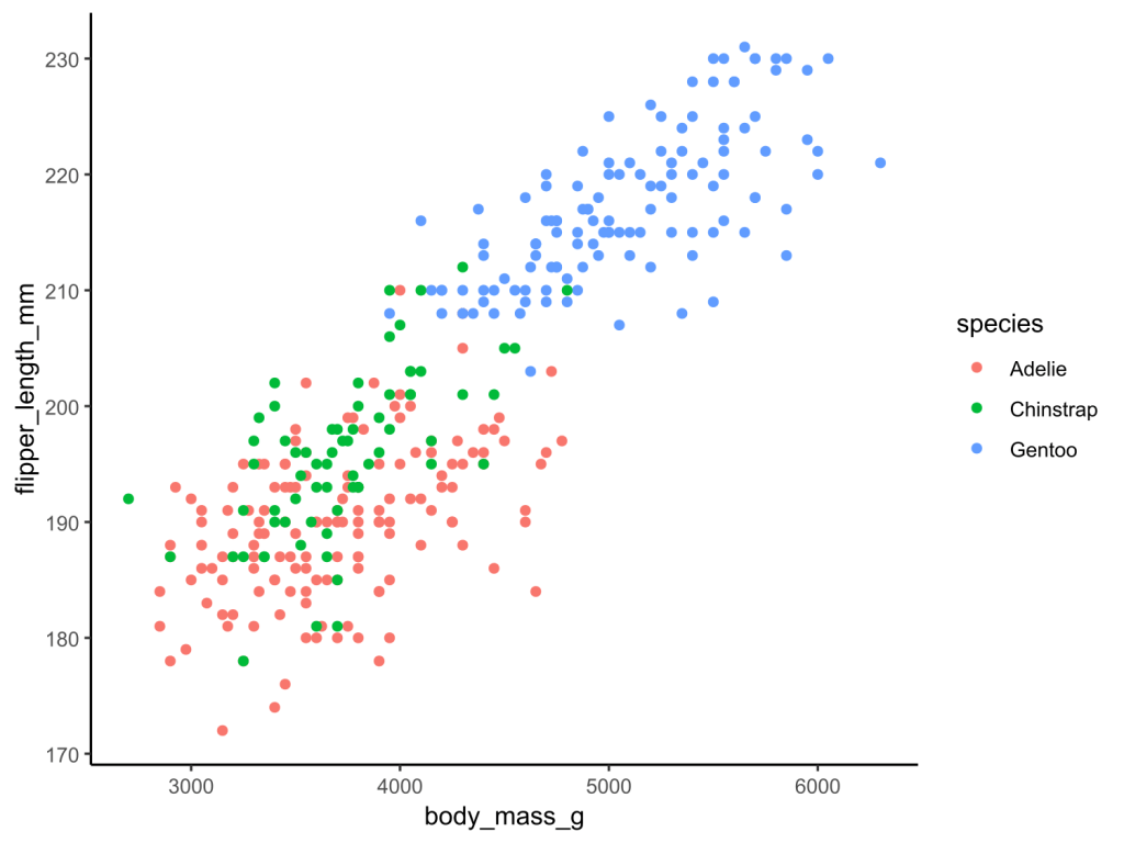
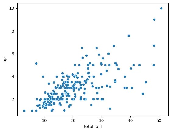
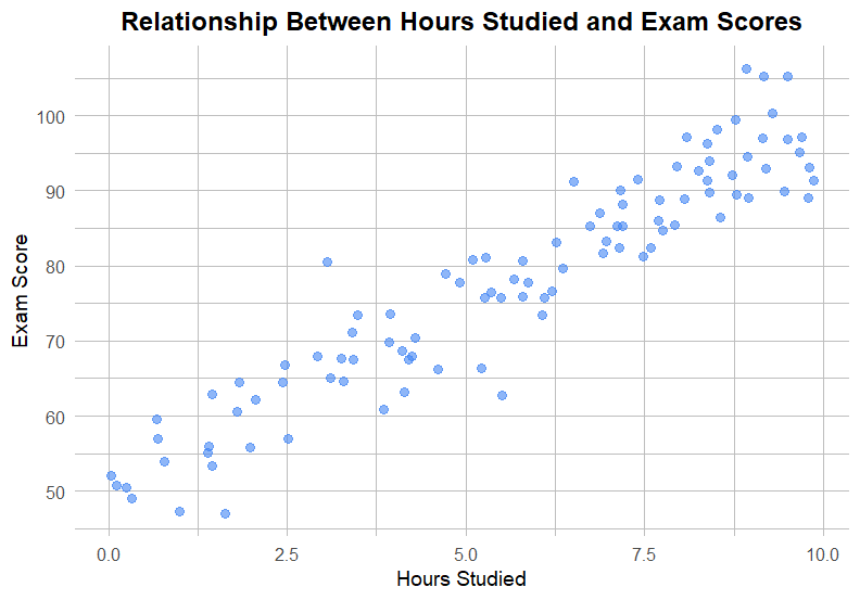
📊 3. Scatter Plots Scatter plot ใช้สำรวจความสัมพันธ์ระหว่างตัวแปร 2 ตัว
ตัวอย่าง:
ความสัมพันธ์ระหว่างจำนวนเงินค่าอาหาร และ tip
# Create a scatter plot of tips vs total bill
sns.scatterplot(data = tips,
                x = "total_bill",
                y = "tip")

# Show the plot
plt.show()
ผลลัพธ์:
Scatter plot Note: จากกราฟ เราจะเห็นได้ว่า จำนวน tip ดูเหมือนจะเพิ่มขึ้นตามจำนวนเงินค่าอาหาร
.
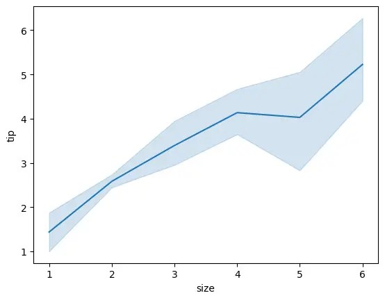
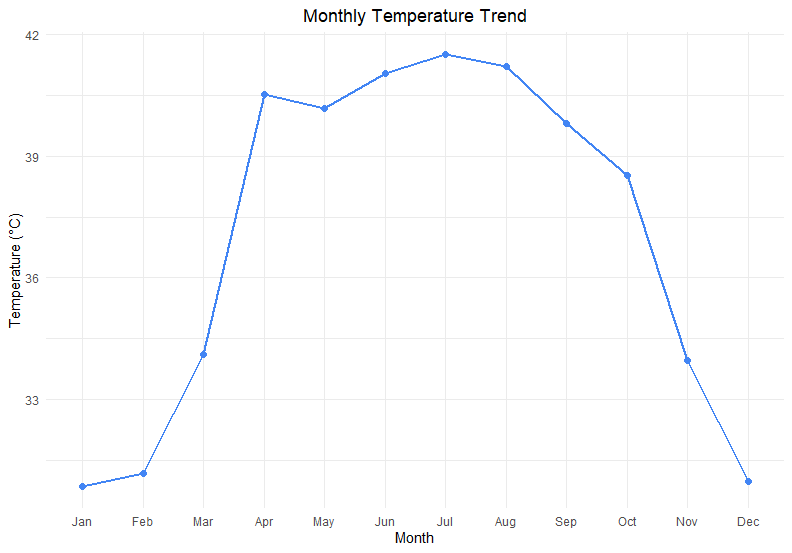
📊 4. Line Plots Line plot ใช้สำรวจการเปลี่ยนแปลงของตัวแปร ตามช่วงเวลา หรือตามตัวแปรอีกตัว
ตัวอย่าง:
ดูการเปลี่ยนแปลงของ tip ตามจำนวนแขก
# Create a line plot of tips vs party size
sns.lineplot(data = tips,
             x = "size",
             y = "tip")

# Show the plot
plt.show()
ผลลัพธ์:
Line plot Note: กราฟแสดงให้เห็นว่า tip เพิ่มขึ้นตามจำนวนแขก
.
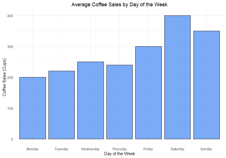
📊 5. Bar Plots Bar plot ใช้สำรวจตัวแปรตามการจัดกลุ่มของตัวแปรอีกตัว
ตัวอย่าง:
ดูจำนวน tip ในแต่ละวันของสัปดาห์
# Create a bar plot of tips vs day of week
sns.barplot(data = tips,
            x = "day",
            y = "tip")

# Show the plot
plt.show()
ผลลัพธ์:
Bar plot Note: เราจะเห็นว่า ในแต่ละวัน พนักงานได้ tip ใกล้เคียงกัน แต่ในวันเสาร์และอาทิตย์จะได้เยอะกว่าวันพฤหัสฯ และวันศุกร์
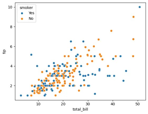
🔵 การใช้สีเพื่อเพิ่มตัวแปรในกราฟ จนถึงตอนนี้ เราจะเห็นว่า กราฟที่เราสร้างได้มีตัวแปร 1-2 ตัวเท่านั้น
ถ้าเราต้องการเพิ่มตัวแปรที่สามเข้าไป (โดยไม่เปลี่ยนประเภทกราฟ) เราสามารถทำได้ง่าย ๆ ด้วยการใช้สี ผ่านการเพิ่ม parametre ชื่อ hue
ยกตัวอย่างเช่น:
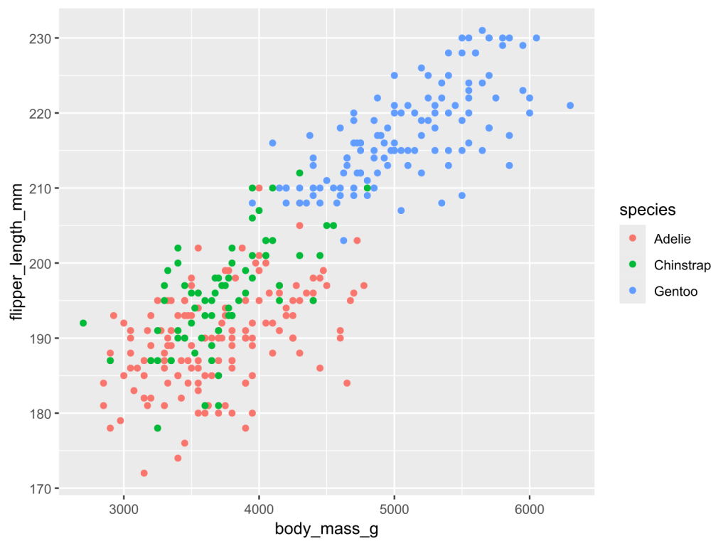
ใน scatter plot ที่แสดงความสัมพันธ์ระหว่าง tip และจำนวนเงินค่าอาหาร เราต้องการเพิ่มตัวแปรการสูบบุหรี่เข้าไปด้วย
ตัวแปร 1: tip
ตัวแปร 2: ค่าอาหาร
ตัวแปร 3: การสูบบุหรี่ของลูกค้า
เราสามารถทำได้ตามนี้:
# Create a scatter plot: tips vs total bill vs smoker types
sns.scatterplot(data = tips,
                x = "total_bill",
                y = "tip",
                hue = "smoker")

# Show the plot
plt.show()
ผลลัพธ์:
Third variable added as hue จากกราฟ เราจะเห็นได้ว่า seaborn จัดการเปลี่ยนสีข้อมูลให้เองโดยอัตโนมัติ
ทั้งนี้ ถ้าเราต้องการเปลี่ยนกราฟเป็นสีอื่น เราต้องปรับ code ของเราเพิ่มเติม
🖼️ การตกแต่งกราฟ
มาดู 3 วิธีในการตกแต่งกราฟ ใน seaborn กัน:
สี
Style
ข้อความ
.
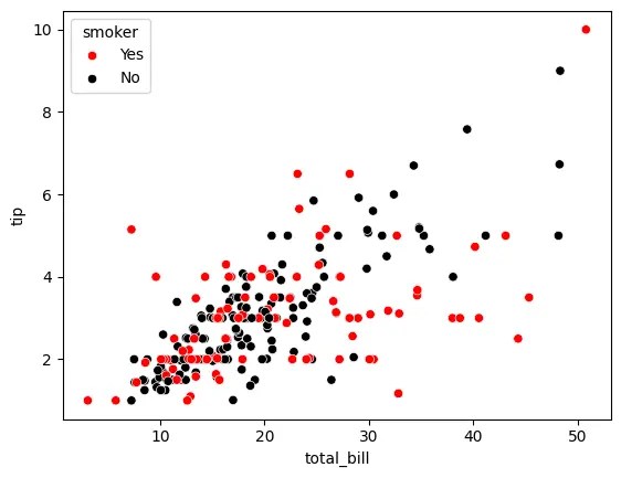
🎨 1. สี ใน seaborn เราสามารถปรับสีของกราฟ ได้ด้วย 2 วิธี:
ใช้ palette
ใช้ sns.set_palette()
.
วิธีที่ 1: กำหนด parametre ที่เรียกว่า palette
เช่น สำหรับ scatter plot ก่อนหน้านี้ ถ้าเราอยากเปลี่ยนข้อมูลเป็นสีดำและแดง เราสามารถเขียน code ได้ดังนี้:
เราสร้าง dictionary ชื่อ colours เพื่อระบุว่า สีไหนจะใช้กับการสูบบุหรี่ประเภทไหน:
# Specify colours
colours = {"Yes": "red",
           "No": "black"}
จากนั้น เราก็ใช้ colours เป็น argument ของ palette:
# Create a scatter plot
sns.scatterplot(data = tips,
                x = "total_bill",
                y = "tip",
                hue = "smoker",
                palette = colours)

# Show the plot
plt.show()
ผลลัพธ์:
Customise colour with palette .
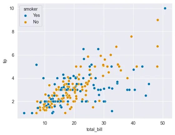
วิธีที่ 2: เรียกใช้ sns.set_palette()
ในกรณีที่เราไม่อยากกำหนด palette เอง เราสามารถเรียก sns.set_palette() แทนได้
sns.set_palette() จะเรียกใช้และ apply ชุดสีที่เราต้องการให้กับกราฟของเราโดยอัตโนมัติ
สำหรับ sns.set_palette() เราสามารถใส่ argument ได้ดังนี้:
No. Argument ค่าสี 1 "deep"ค่า default ที่ seaborn ใช้ 2 "muted"เป็น "deep" เวอร์ชันสีอ่อนกว่า 3 "pastel"สีพาสเทล 4 "dark"สีเข้ม 5 "colorblind"สีสำหรับคนตาบอดสี
เช่น:
สร้าง scatter plot โดยใช้ "colorblind":
เราเรียกใช้ sns.set_palette() โดยใส่ argument เป็นชื่อ palette ที่ต้องการใช้ (ในกรณีนี้ คือ "colorblind" ซึ่งเหมาะกับคนตาบอดสี):
# Set the palette
sns.set_palette("colorblind")
จากนั้น สร้าง scatter plot เหมือนเดิม (3 ตัวแปร แต่ไม่มี palette):
# Create a scatter plot
sns.scatterplot(data = tips,
                x = "total_bill",
                y = "tip",
                hue = "smoker")

# Show the plot
plt.show()
ผลลัพธ์:
Customise colour with sns.set_palette() .
🎨 2. Style นอกจากการเปลี่ยนสีกราฟแล้ว เรายังสามารถปรับ style ของกราฟ ได้ ผ่าน sns.set_style()
โดยสำหรับ sns.set_style() เราสามารถใส่ argument ได้ดังนี้:
No. Argument สีพื้นหลัง สีเส้นกราฟ 1 "white"ขาว ⚪ ขาว ⚪ 2 "dark"ดำ ⚫ ดำ ⚫ 3 "whitegrid"ขาว ⚪ ดำ ⚫ 4 "darkgrid"ดำ ⚫ ขาว ⚪ 5 "ticks"ขาว ⚪ ไม่มี ✖️
Note:
"white" เป็นค่า default ของ seaborn"tick" เหมาะสำหรับกราฟที่เราต้องการเน้นแกน x และ y
ยกตัวอย่างเช่น:
เราต้องการปรับกราฟของเราเป็น dark theme ที่มี grid:
กำหนด argument ของ sns.set_style() เป็น "darkgrid":
# Set the style
sns.set_style("darkgrid")
# Create a scatter plot
sns.scatterplot(data = tips,
                x = "total_bill",
                y = "tip",
                hue = "smoker")

# Show the plot
plt.show()
ผลลัพธ์:
Customise style with sns.set_style() .
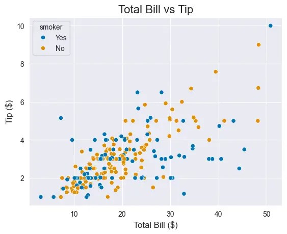
🎨 3. ข้อความ นอกจากสีและ style แล้ว เรายังสามารถตกแต่งกราฟเพิ่มเติม ด้วยการเพิ่มข้อความกำกับกราฟ อย่าง title และ labels (ชื่อแกน x และ y) ได้ด้วย
เราสามารถทำสิ่งนี้ได้โดยใช้ functions ของ matplotlib (plt) แบบนี้:
# Create a scatter plot
sns.scatterplot(data = tips,
                x = "total_bill",
                y = "tip",
                hue = "smoker")
# Add a title
plt.title("Total Bill vs Tip", fontsize = 16)
# Add labels
plt.xlabel("Total Bill ($)", fontsize = 12)
plt.ylabel("Tip ($)", fontsize = 12)
# Show the plot
plt.show()
ผลลัพธ์:
Adding title and labels with plt.title(), and plt.xlabel() and plt.label() Note: จะเห็นแล้วว่า ตอนนี้กราฟของเรามีข้อความกำกับหัวข้อกราฟ (title) รวมทั้งแกน x และ y (labels)
💪 สรุป Seaborn 101
ในบทความนี้ เราเรียนรู้วิธีการสร้างกราฟง่าย ๆ ใน seaborn กัน
โดยเราเริ่มจากการสร้างกราฟพื้นฐาน 5 อย่าง:
กราฟ Seaborn Histogram sns.histplot()Box plot sns.boxplot()Scatter plot sns.scatterplot()Line plot sns.lineplot()Bar plot sns.barplot()
พร้อมการเพิ่มตัวแปรที่สาม:
เพิ่มตัวแปรที่สาม Seaborn เพิ่มผ่านสี hue
และจบด้วยการปรับแต่งกราฟ:
ปรับแต่ง Seaborn สี palettesns.set_palette()Style sns.set_style()ข้อความ plt.title()plt.xlabel()plt.ylabel()
⏭️ Next
หวังว่า บทความนี้จะเป็นประโยชน์สำหรับคนที่ต้องการเรียนรู้เบื้องต้นเกี่ยวกับ seaborn
.
🧑💻 Example Code on GitHub
สำหรับใครที่ต้องการลงมือทำเอง สามารถดูตัวอย่าง code ของบทความนี้ได้ที่ GitHub
.
📚 Further Reading
สำหรับคนที่ต้องการเรียนรู้เพิ่มเติม สามารถอ่านเกี่ยวกับ seaborn ได้ตาม link ด้านล่าง: